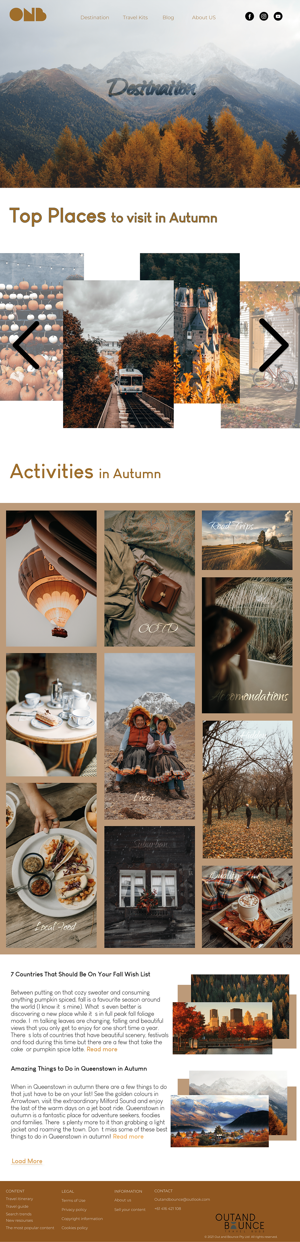
Designing a Travel Blog That Goes Beyond Information
Out & Bounce is not a typical travel blog. My goal was to design a platform that doesn’t just tell people where to go, but actually takes them there through immersive visuals, intuitive structure, and a premium user experience. Most travel blogs rely on long text, cluttered layouts, and inconsistent visuals. I wanted to break that pattern by creating a design that feels modern, aspirational, and effortless to use a space where travellers can discover hidden gems, learn practical travel hacks, and feel inspired to explore the world. This project reflects my approach as a designer who goes beyond standard templates. I focus on aesthetic clarity, emotional storytelling, and frictionless usability to elevate the entire digital experience.

Research & Insights
I began by researching how travellers interact with online content, focusing on what motivates them to read, explore, and return to a travel platform. I found that travellers want quick, trustworthy tips paired with strong visual inspiration that sparks curiosity. They prefer clear, simple guidance rather than long, overwhelming text, and they connect more deeply with personal stories and practical travel hacks that feel authentic. They also enjoy browsing destinations easily and moving fluidly between ideas. These insights shaped the foundation of the design and guided me toward creating a platform that blends inspiration, information, and usability into a seamless experience.
Iterations & Refinement
Once the structure was established, I went through multiple rounds of refinement to enhance clarity, visual rhythm, and emotional impact. I adjusted spacing, typography, and layout patterns to create a more polished and premium feel. Each iteration focused on removing unnecessary elements and strengthening the overall experience, ensuring that every part of the design served a purpose and contributed to a smooth user journey.
Final Outcome
The final design is a travel blog platform that feels modern, inspiring, and user‑centred. It blends aesthetics with functionality, offering travellers a space where they can discover new destinations, learn practical travel hacks, and feel motivated to explore the world. The platform elevates the typical travel blog experience and reflects my ability to design beyond the basics, creating digital experiences that are visually refined, intuitive, and emotionally engaging.